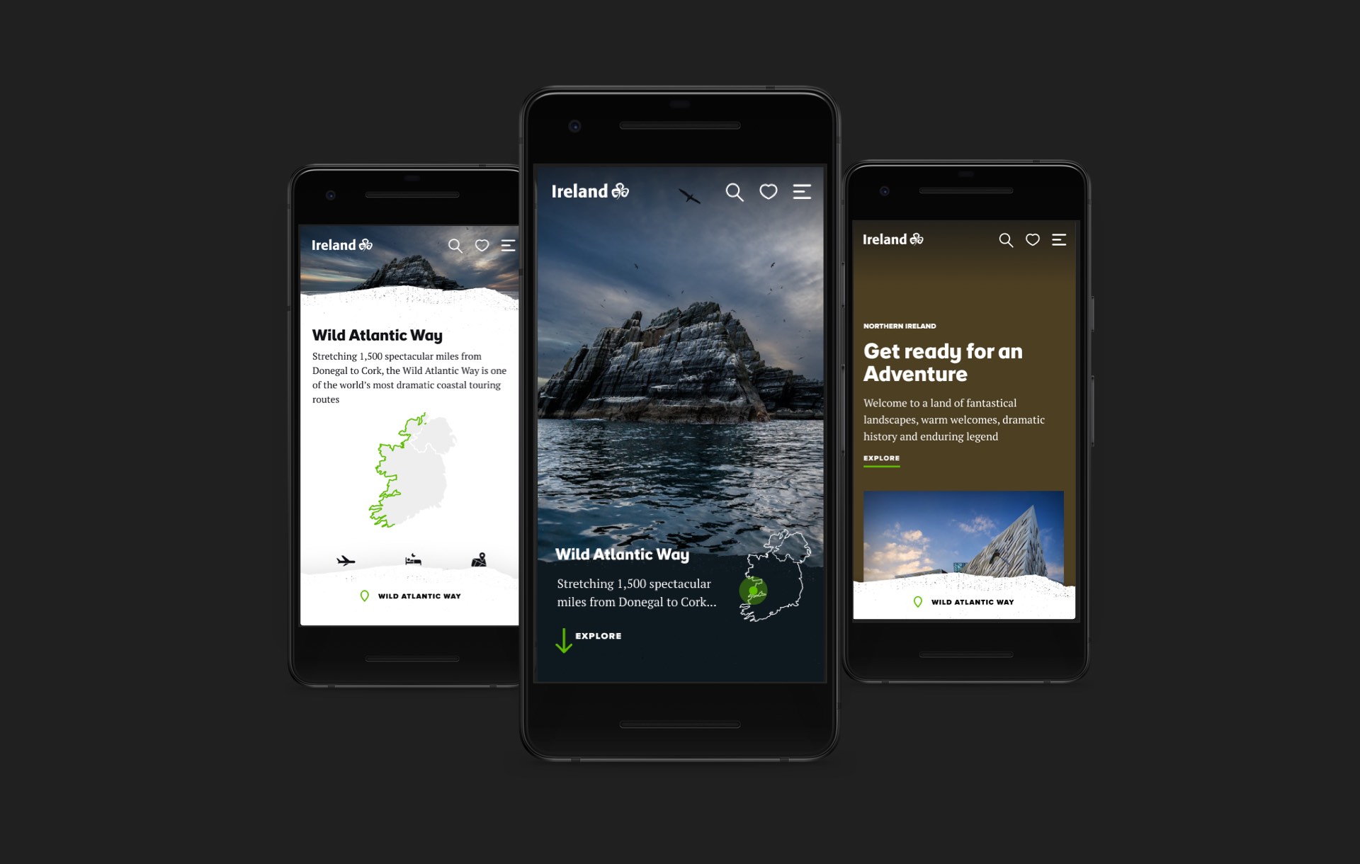
Tourism Ireland
Lead designer on a major digital and brand re-design for Tourism Ireland (Ireland.com 2020).
Created Design Directions (UI principles and Art directions) as well as sketching wireframes(UX) and designing prototypes (UI).
Also involved in the high-level strategy, client presentations & workshops.
01. Research
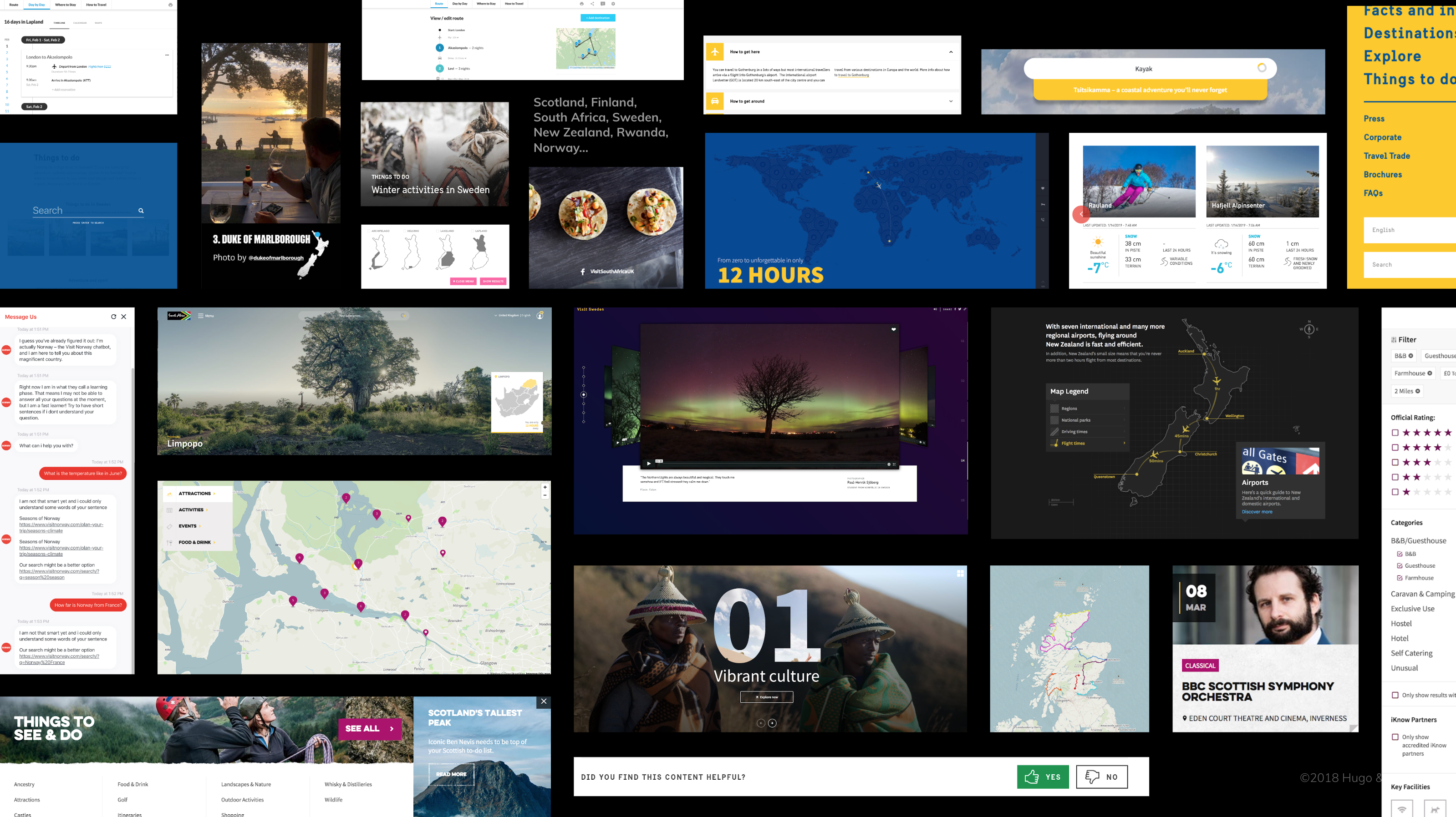
Competitive analysis
Spent one month collecting best examples into Confluence with screenshots and collective comments.
Experiments
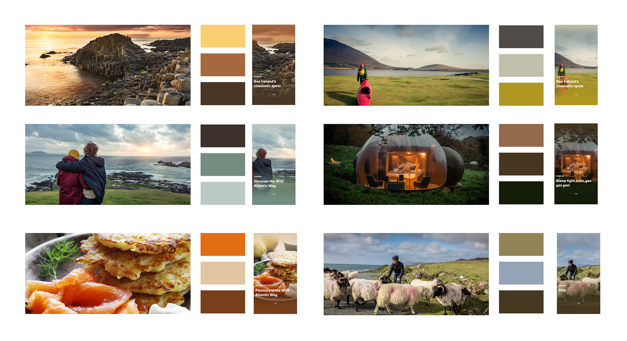
Exploring ways to create automated ways to personalise colour per pages.
By picking the dominant colours of an image with online tools, I created gradient overlays making the type legible.
Prototypes
For each hypothesis, I created a prototype that the UX team would test with Validately.
This one if for "formalise" transforming an idea into a concept.
Pitch
The pitch video that helped us demonstrate our vision for the product.
Created all the screen designs and mock-ups based on an agreed storyboard.
Outcomes
At the end of the research phase, I created a Design Direction document to frame the next phase of delivery.
It includes Brand and UI principles supporting the overall strategy.
Quirk
The use of white spaces with non-aligned components will aim to carry the irish quirk and folklore.
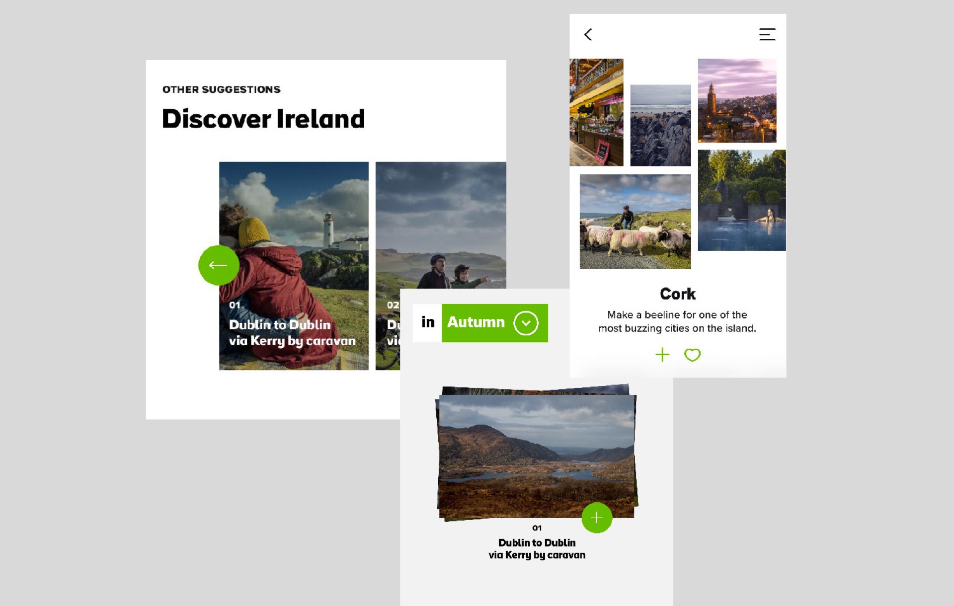
Warm
Generous use of colours and playful use of interactions will make the experience warm and welcoming.
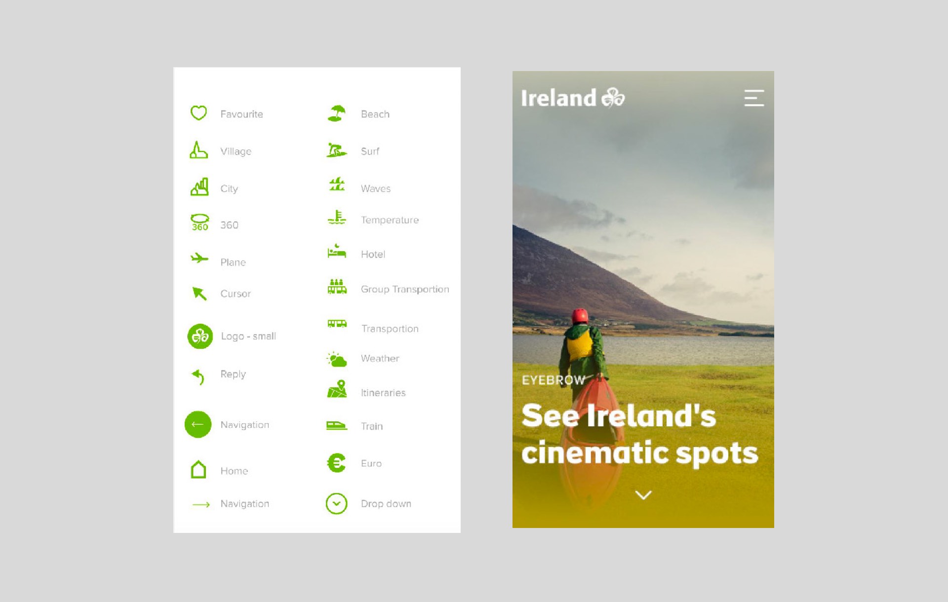
Striking
The full screen layout and high contrast in shapes and typography will play with the sense of scale.
02. Concept
Overarching principle
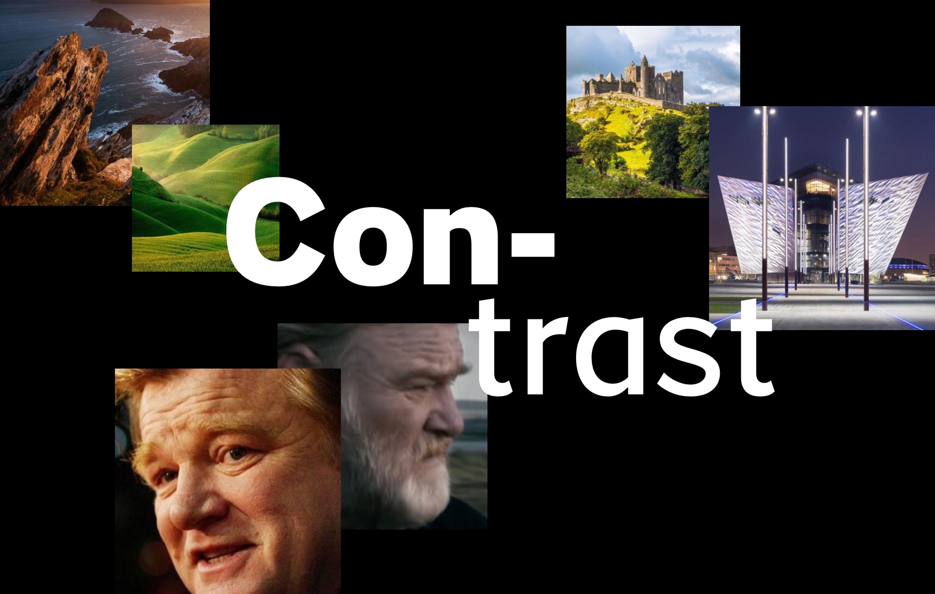
After 4 months of research, I combined all the design directions (Quirk, Warm, Striking) into one single overarching principle: Contrast.
Design development presentation
How we show this visually
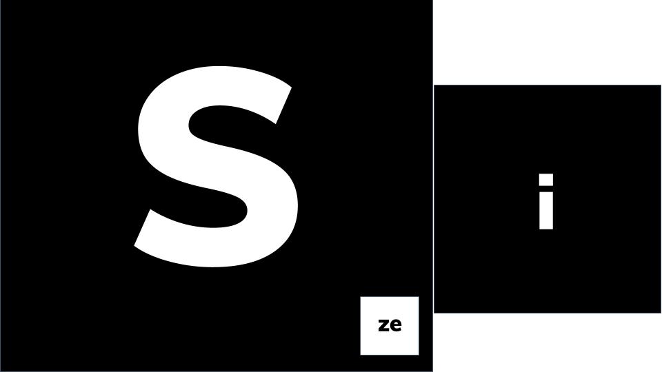
Contrast of size
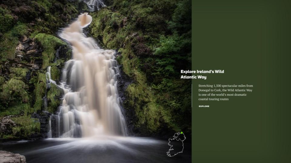
Contrast of colour
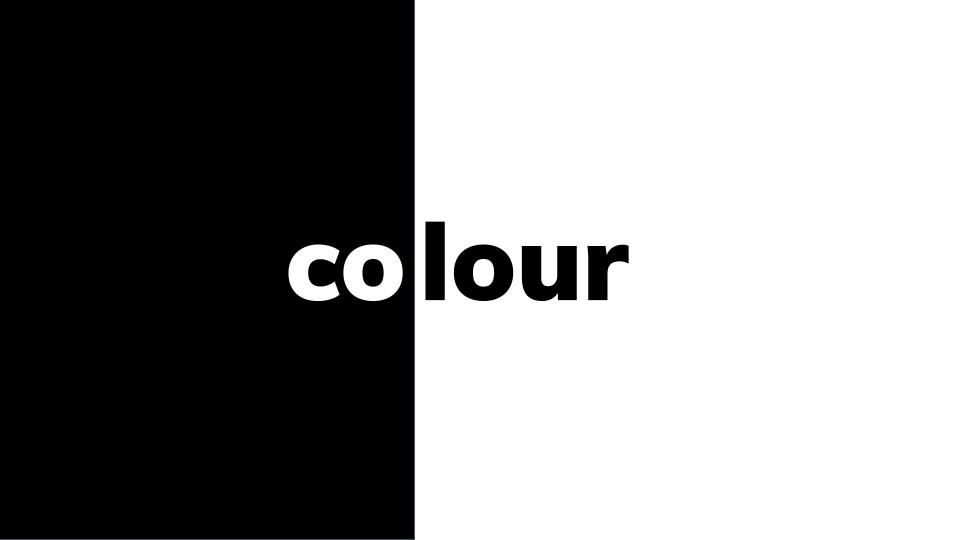

How we show
this with content
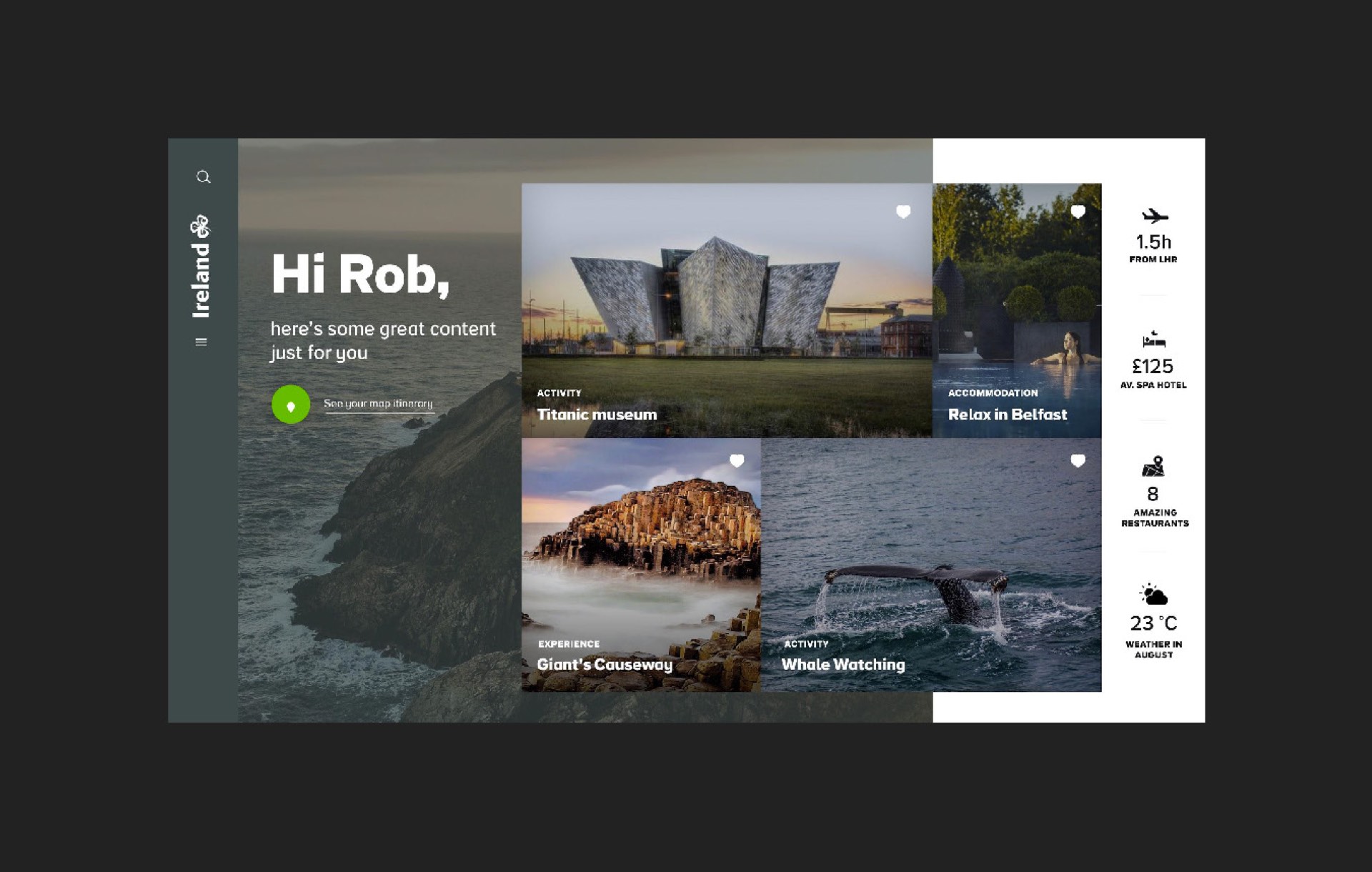
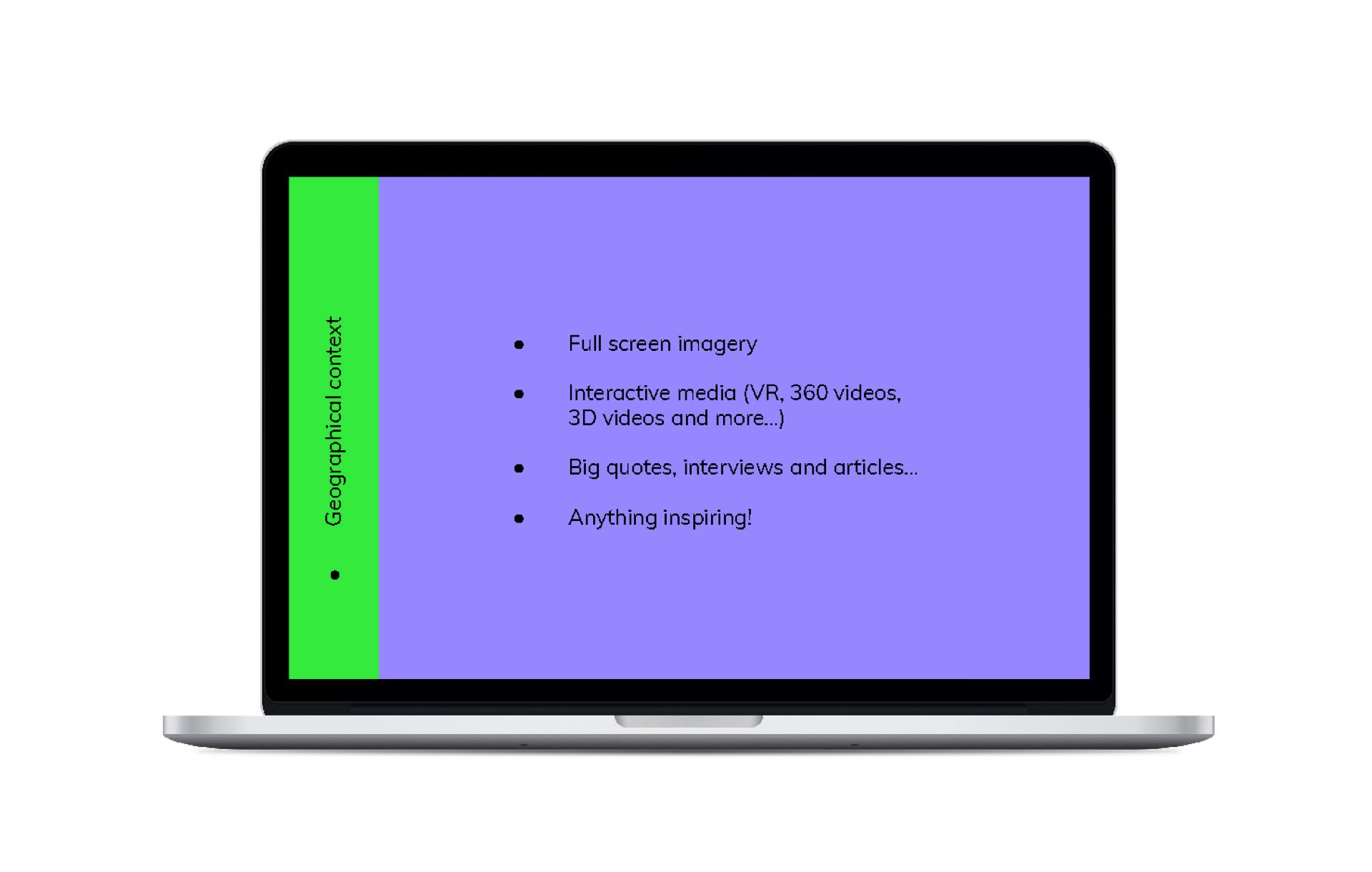
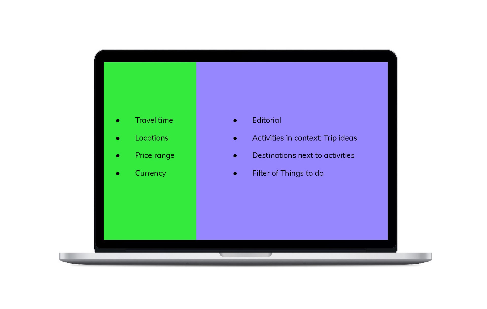
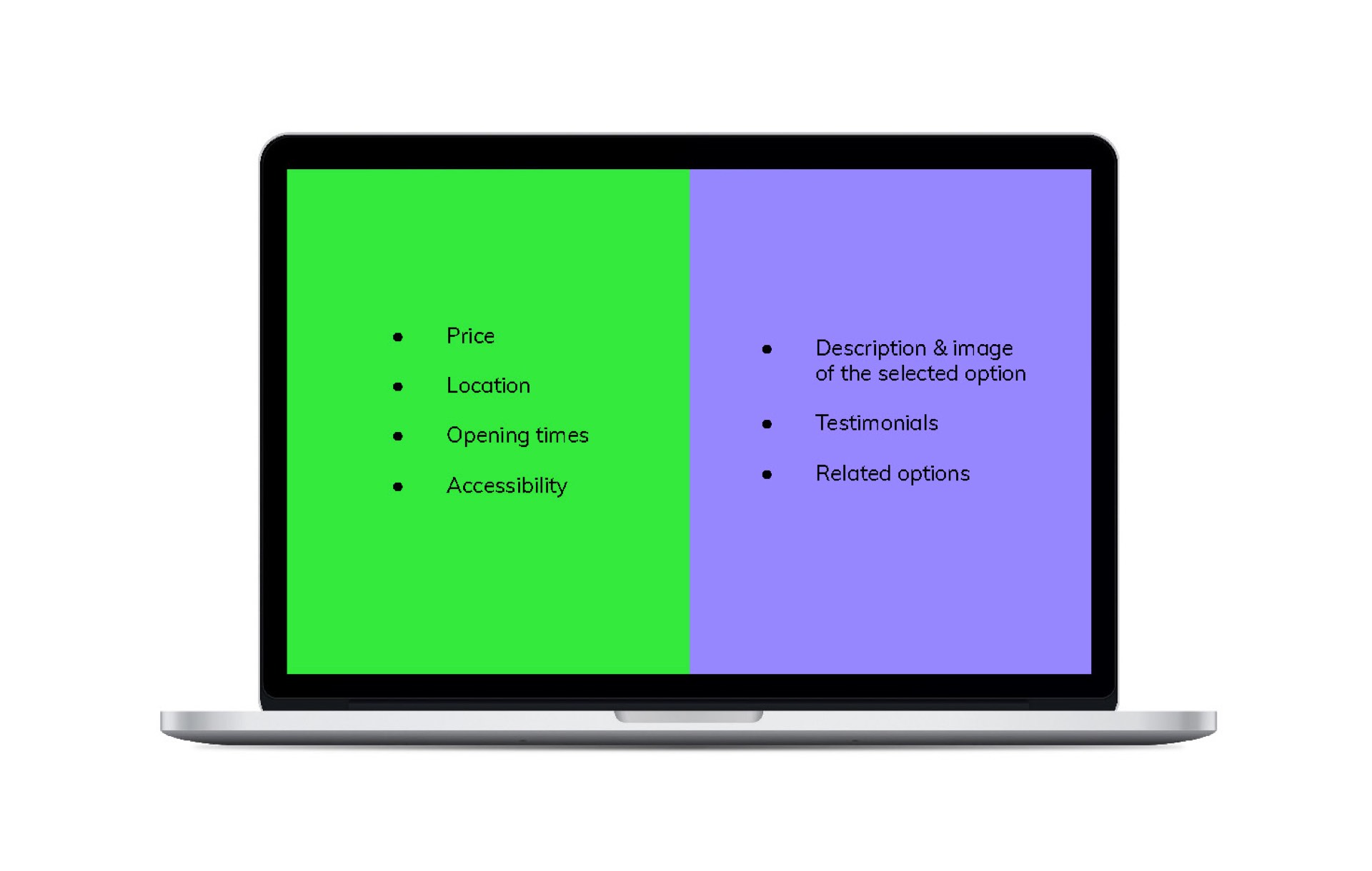
As a user, the more you go down the funnel, the more you need your content to be contextualised with map, budget, travel options...
Therefore the split evolve with the needs by growing as the user go down the funnel: Inspire, formalise and plan.
3. Designs
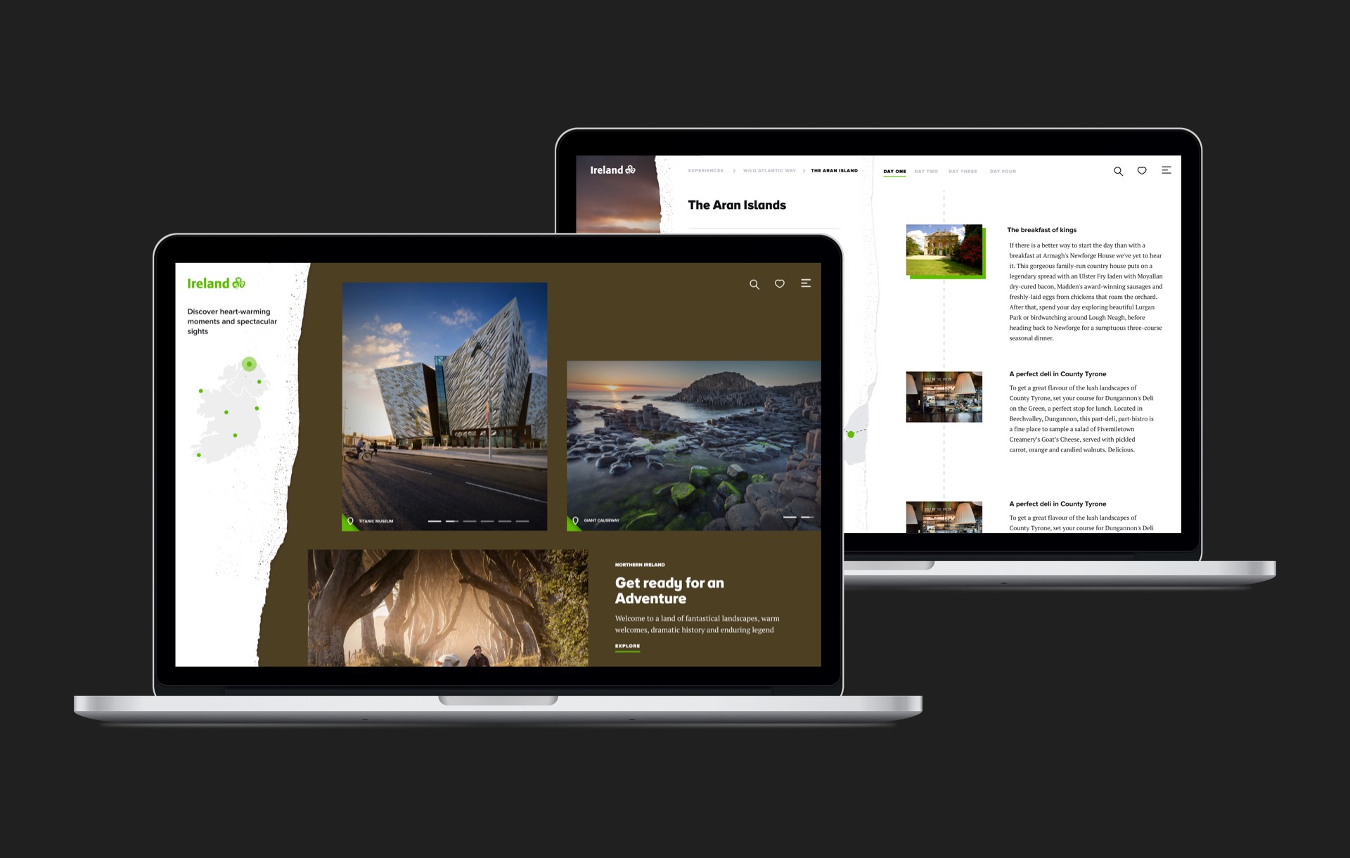
Prototypes
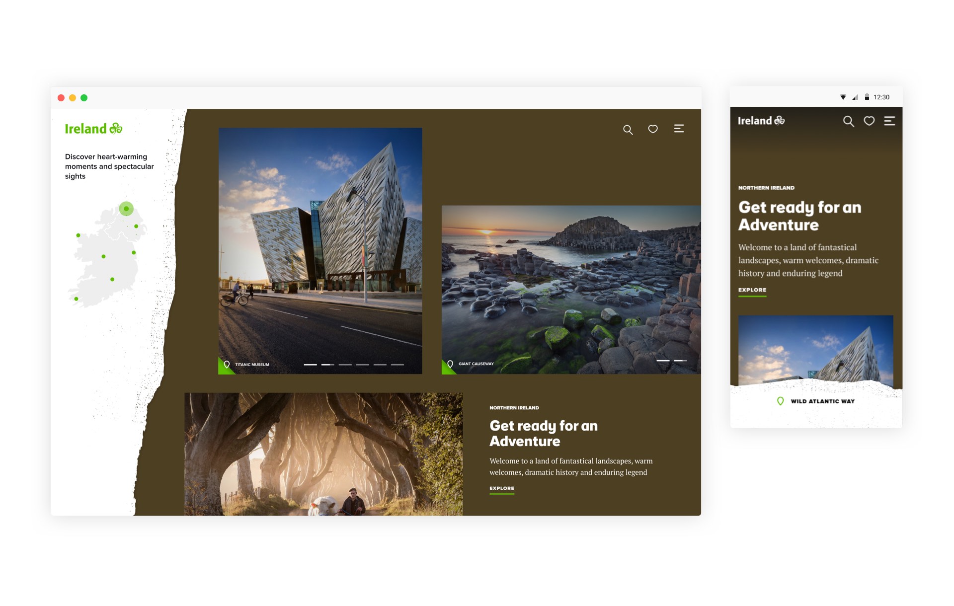
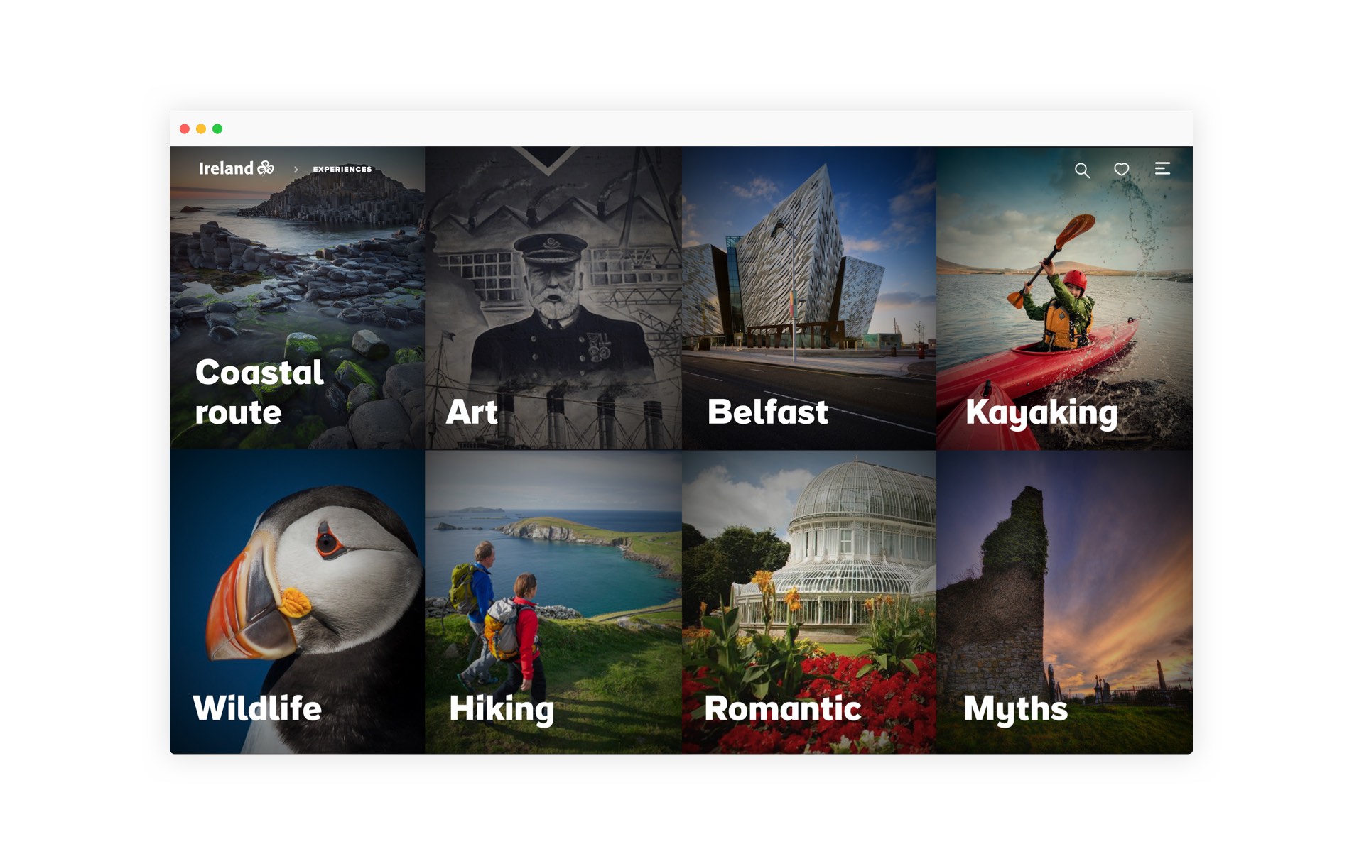
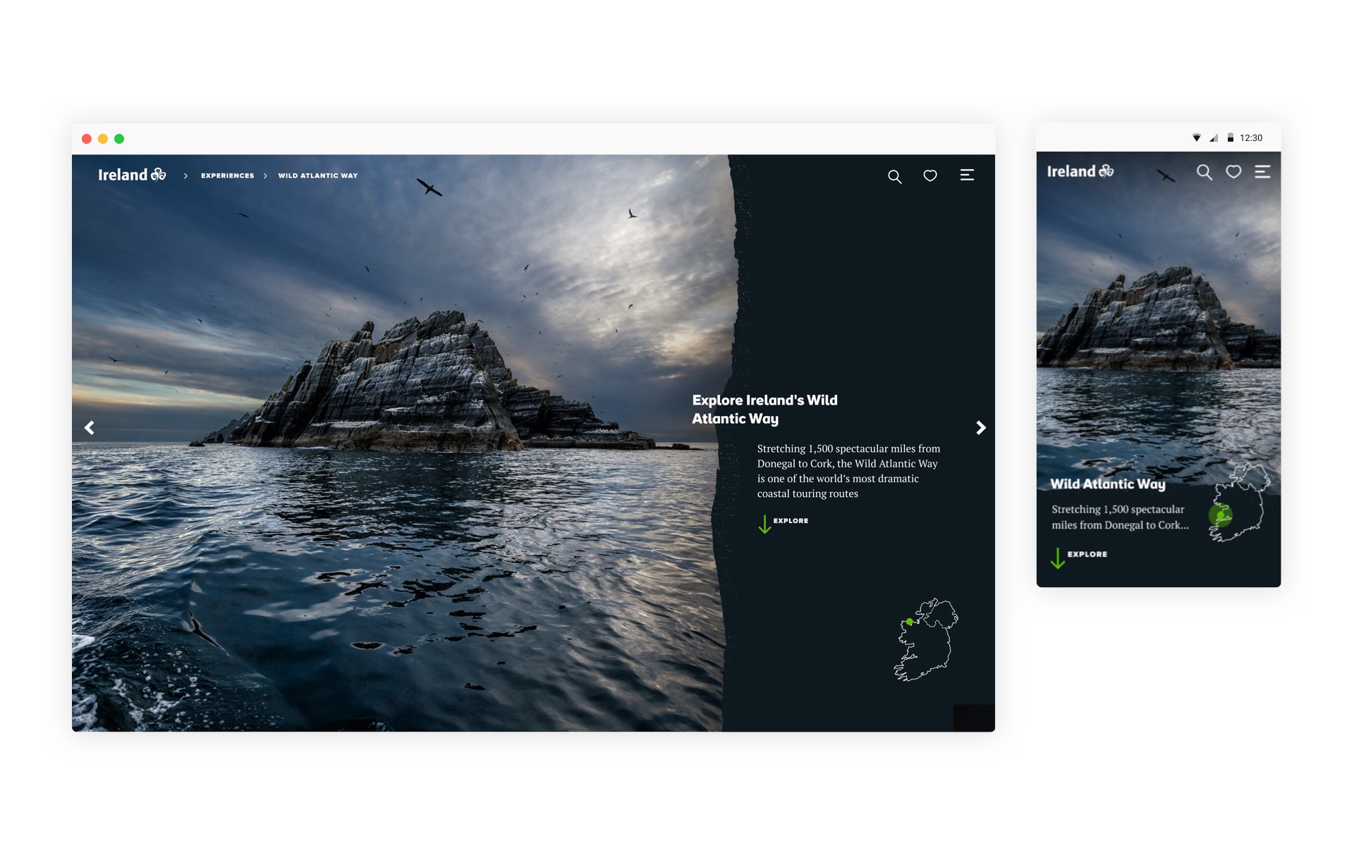
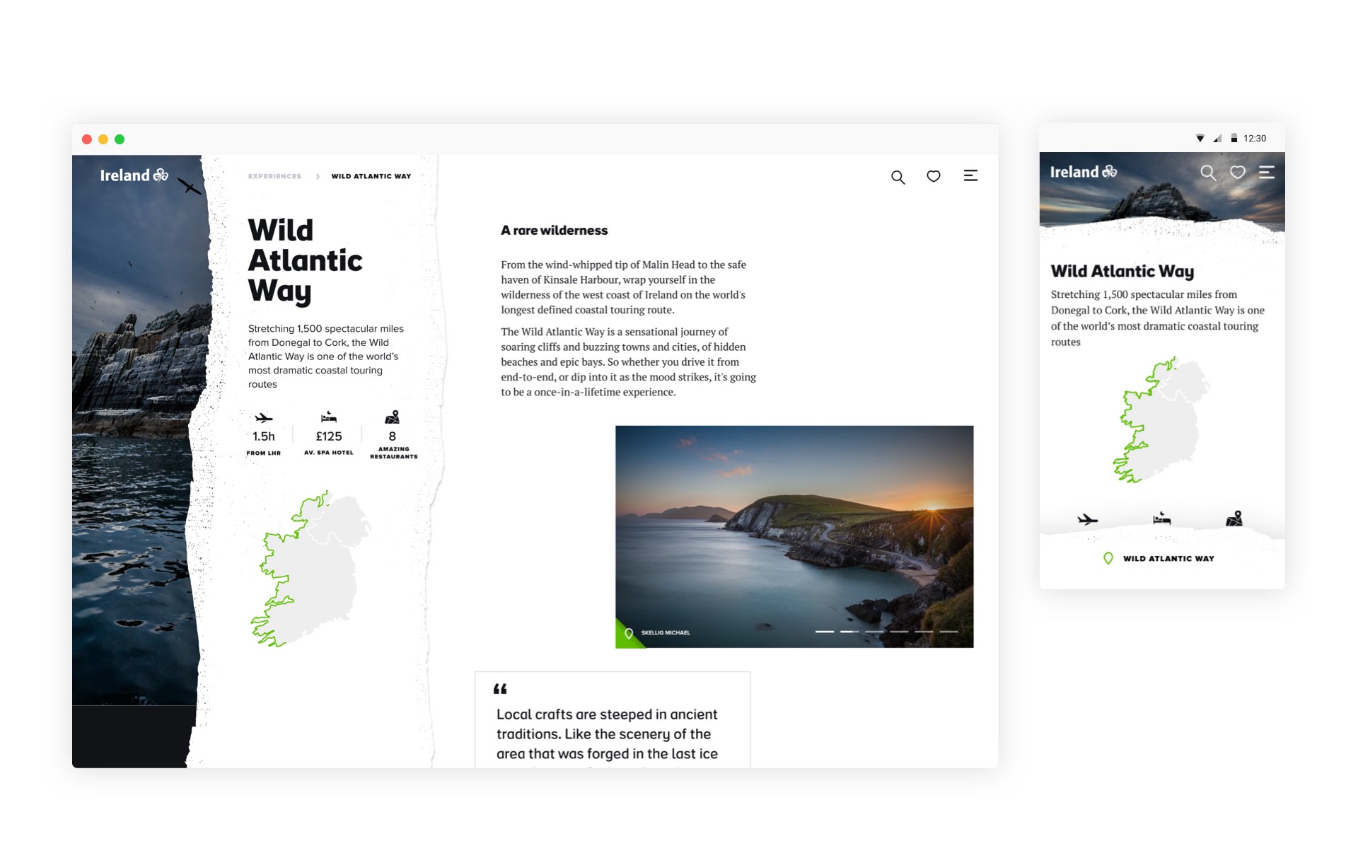
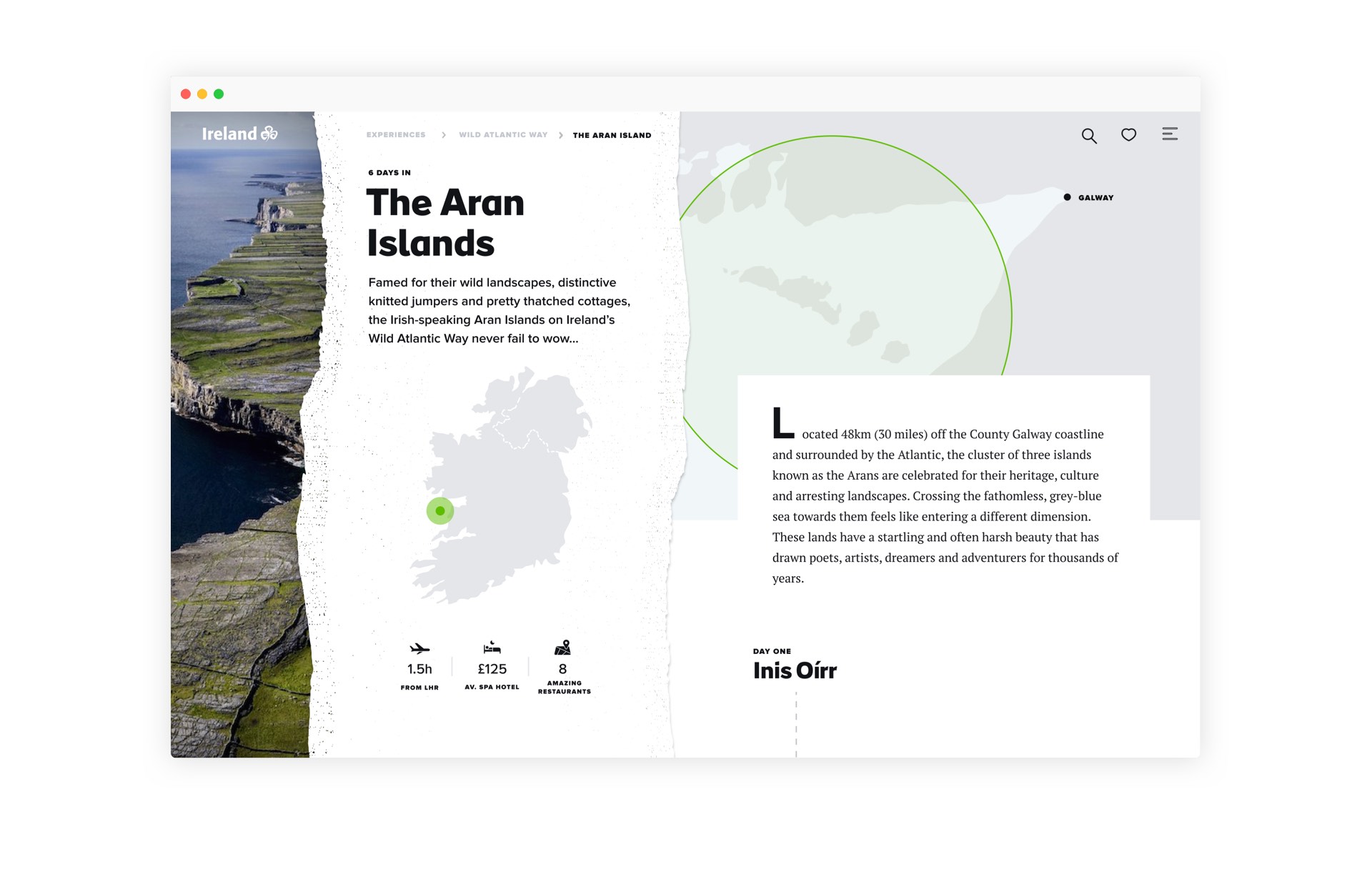
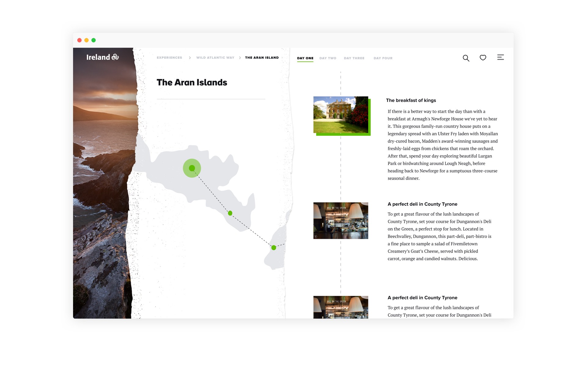
Page designs
© 2022 Coucou Design
